
Responsive Design
What is Responsive Design?
Websites using responsive design automatically make allowances for the changing screen resolution and size used to view a Website. The rapid growth of Smartphones and tablet users dictates that your Website be accessible from all media types. Responsive design accomplishes this effortlessly. — This Website uses responsive design. You can test this by changing the size of your Web browser to see the sections move below one another for continuously viewing. No more scrolling from side to side to view the complete screen.
When the Web browsers detects the user is viewing the Website from a Smartphone or tablet it automatically stacks the sections and reduces the image size to fit the device screen size. It accounts for both landscape and portrait views. Keeping this concept in mind the Web designer should create each Web page so that the flow of content is consistent on all screen sizes. What looks good on a desktop may not flow in the same pattern on a Smartphone or a tablet.
The following Websites are designed using responsive code.
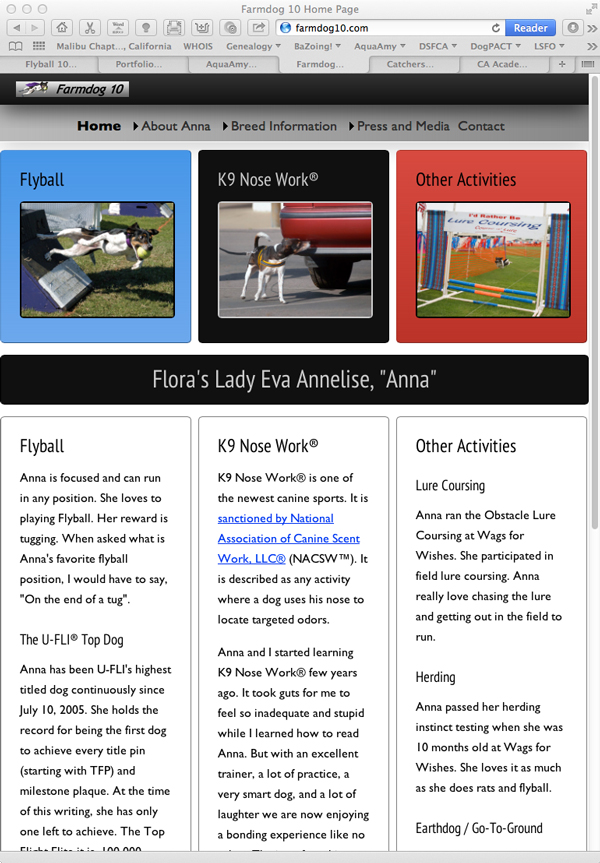
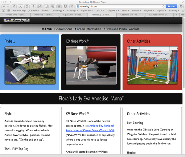
Farmdog10.com
This is a view of the home page on a Desktop
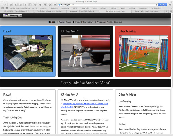 |
| Full screen Desktop view 1600 X 1200 |
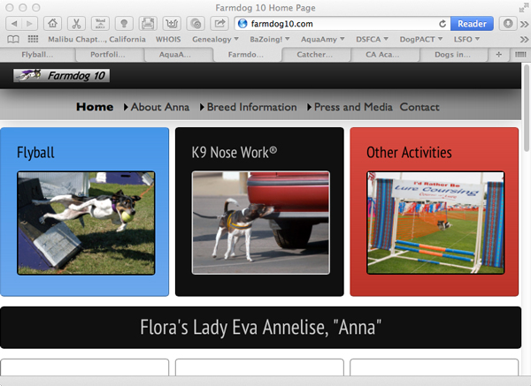
This is a view of the home page on a laptop
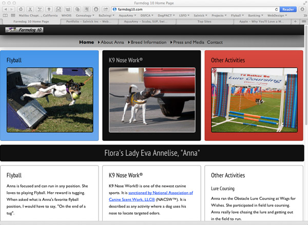 |
| Full screen 15" Laptop view 1440 X 900 |
This is a Portrait view on a Tablet
 |
| Tablet Portrait view 780 X 1024 |
This is a Landscape view on a Tablet
 |
| Tablet Landscape view 1024 X 780 |
This is a Portrait view on a Smartphone
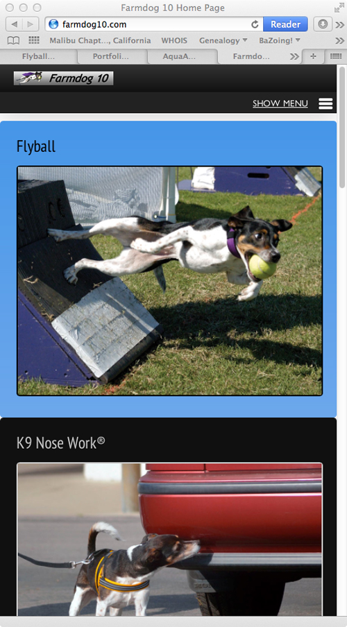 |
| Smartphone Portrait view 320 X 480 |
This is a Portrait view with open menu on a Smartphone
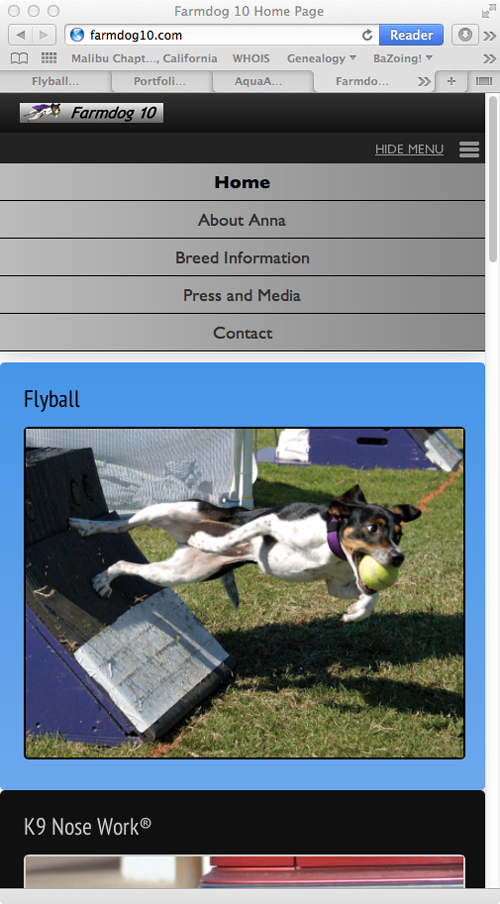 |
| Smartphone Portrait view 320 X 480 |
This is a Landscape view on a Smartphone
 |
| Smartphone Landscape view 480 X 320 |
Visit Live Website: www.farmdog10.com
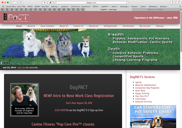
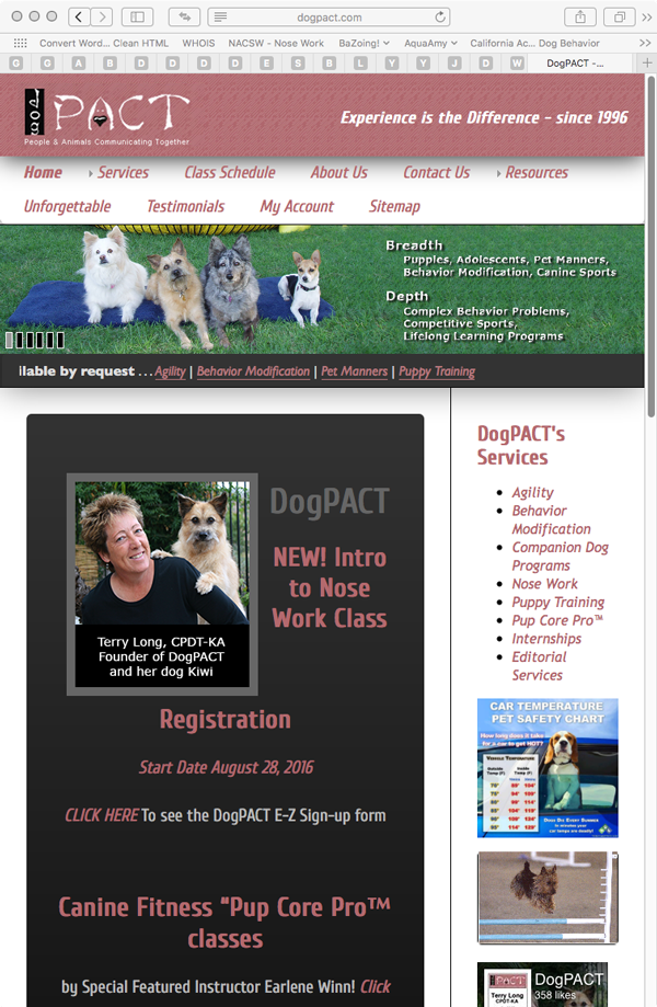
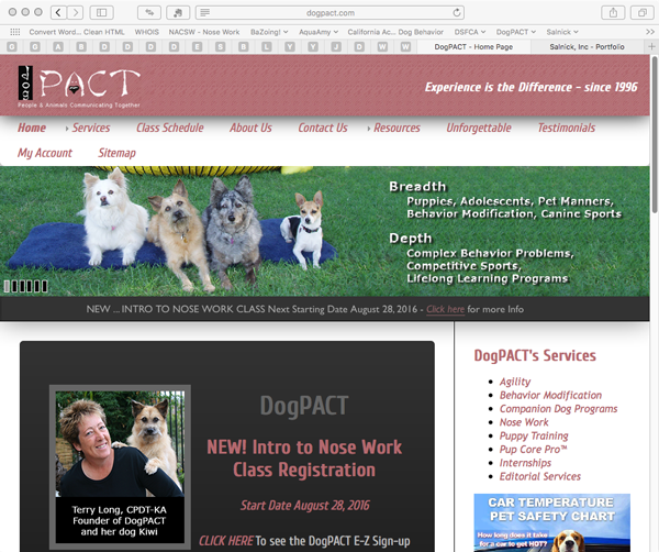
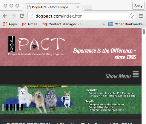
DogPACT
This is a view of the home page on a Desktop
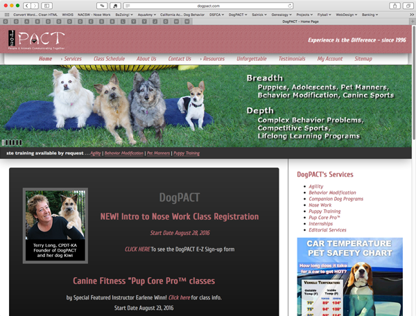 |
| Full screen Desktop view 1600 X 1200 |
This is a view of the home page on a laptop
 |
| Full screen 15" Laptop view 1440 X 900 |
This is a Portrait view on a Tablet
 |
| Tablet Portrait view 780 X 1024 |
This is a Landscape view on a Tablet
 |
| Tablet Landscape view 1024 X 780 |
This is a Portrait view on a Smartphone
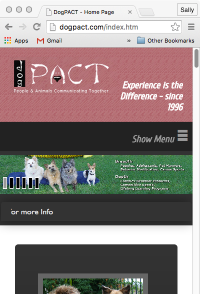 |
| Smartphone Portrait view 320 X 480 |
This is a Landscape view on a Smartphone
 |
| Smartphone Landscape view 480 X 320 |
Visit Live Website: www.dogpact.com
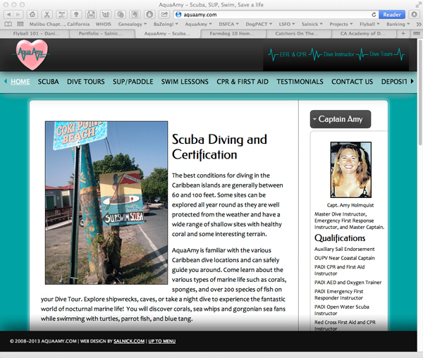
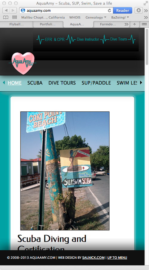
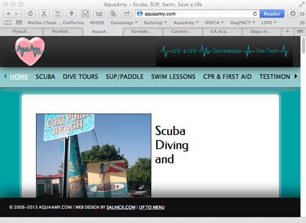
AquaAmy.Com
This page was designed using 4 columns in the full view. When the Web browsers detects the user is viewing the site from a Smartphone or Tablet it automatically stacks the colmns and reduces the image size to fit the Smartphone screen size.
This is a view of the home page on a Desktop
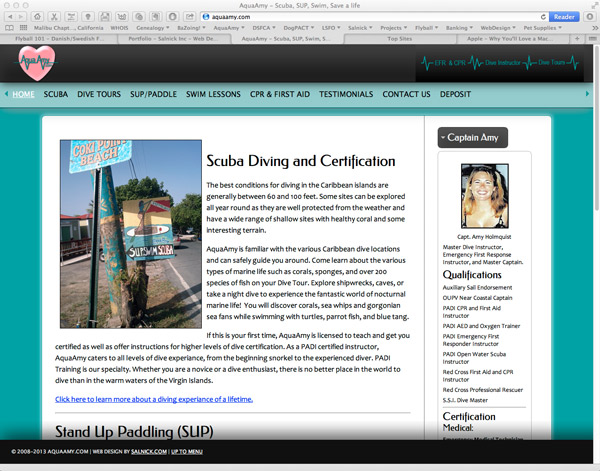 |
| Full screen Desktop view 1600 X 1200 |
This is a view of the home page on a laptop
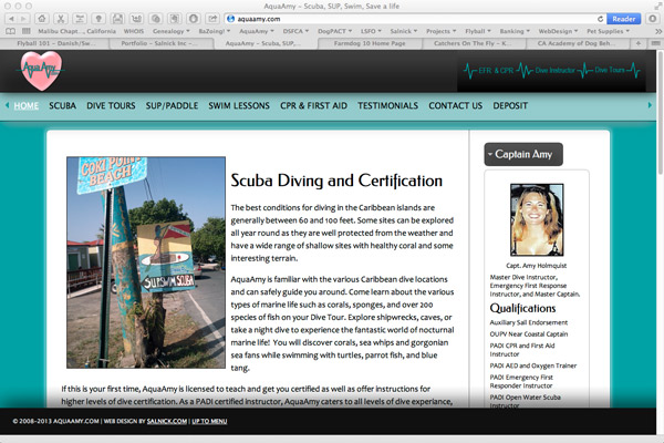 |
| Full screen 15" Laptop view 1440 X 900 |
This is a Portrait view on a Tablet
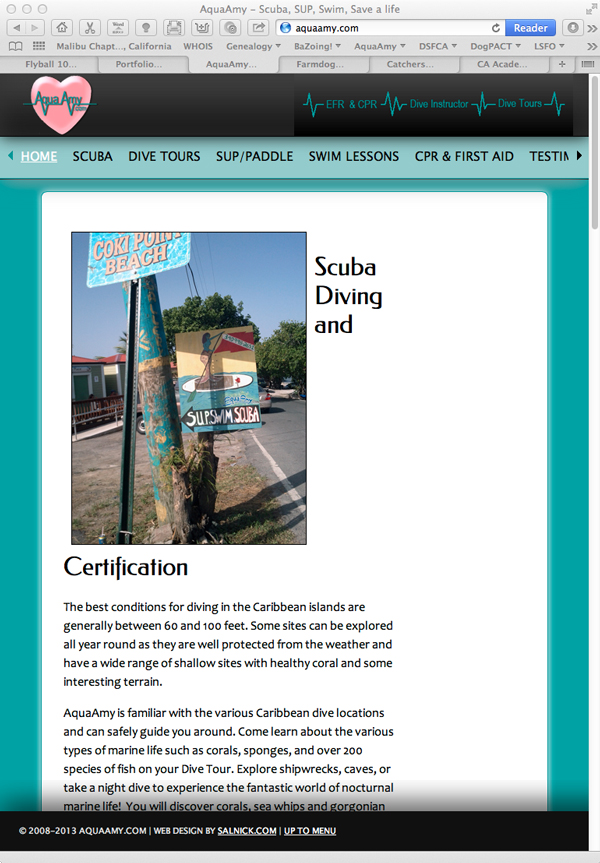 |
| Tablet Portrait vie 780 X 1024 |
This is a Landscape view on a Tablet
 |
| Tablet Landscape view 1024 X 780 |
This is a Portrait view on a Smartphone
 |
| Smartphone Portrait view 320 X 480 |
This is a Landscape view on a Smartphone
 |
| Smartphone Landscape view 480 X 320 |
Visit live Website: www.AquaAmy.com
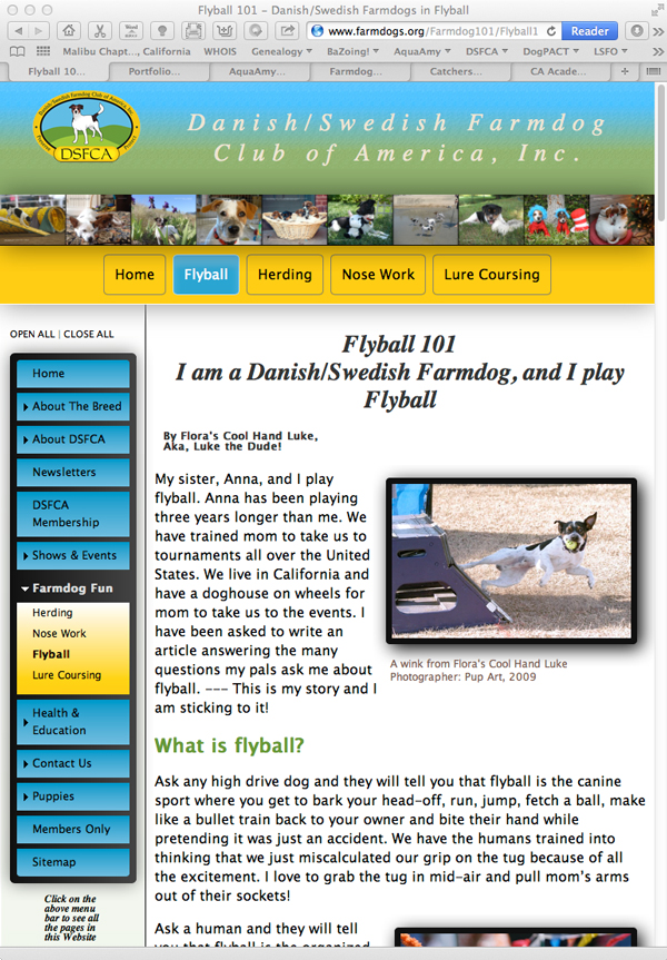
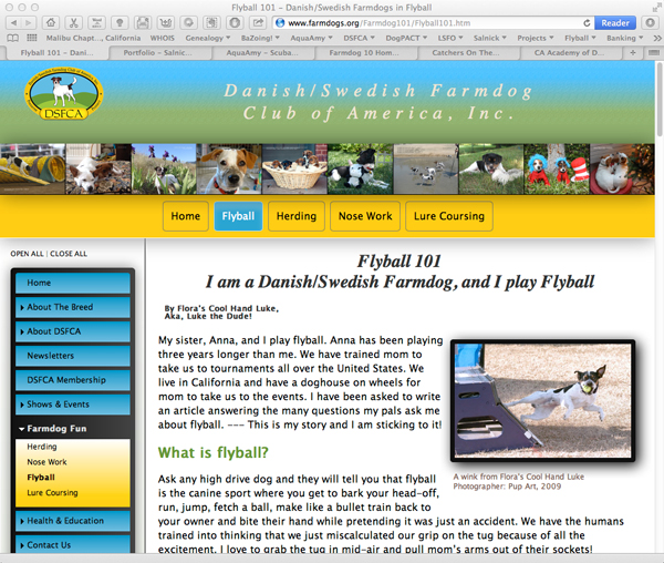
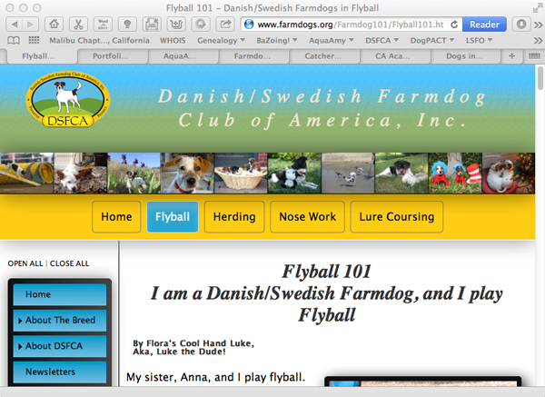
Danish/Swedish Farmdog Club of America, Inc.
This is a view of the home page on a Desktop
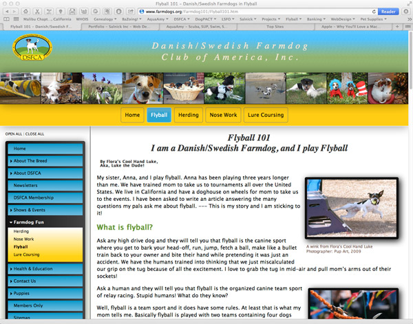 |
| Full screen Desktop view 1600 X 1200 |
This is a view of the home page on a laptop
 |
| Full screen 15" Laptop view 1440 X 900 |
This is a Portrait view on a Tablet
 |
| Tablet Portrait view 780 X 1024 |
This is a Landscape view on a Tablet
 |
| Tablet Landscape view 1024 X 780 |
This is a Portrait view on a Smartphone
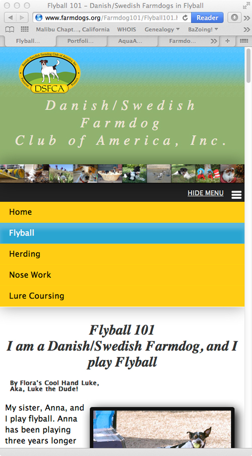 |
| Smartphone Portrait view 320 X 480 |
This is a Landscape view on a Smartphone
 |
| Smartphone Landscape view 480 X 320 |
Visit Live Website: www.farmdogs.org
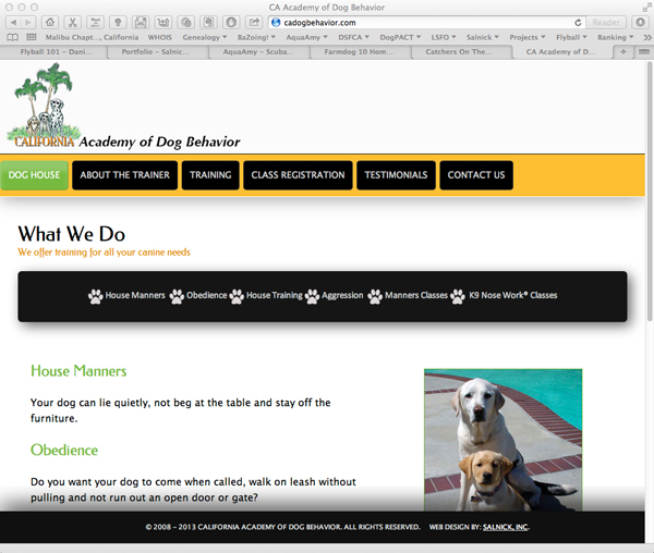
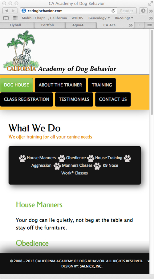
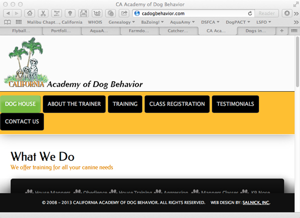
California Academy of Dog Behavior
This is a view of the home page on a Desktop
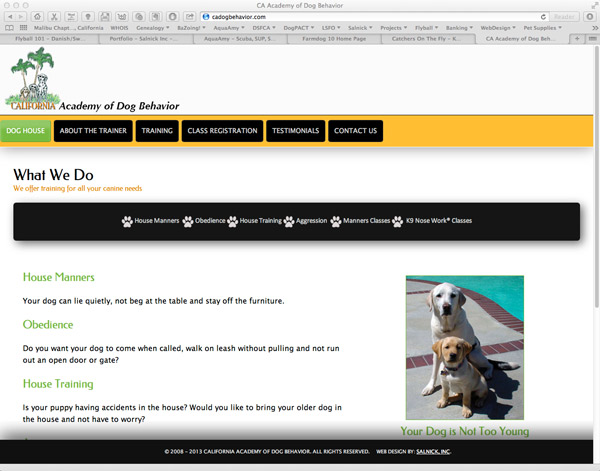 |
| Full screen Desktop view 1600 X 1200 |
This is a view of the home page on a laptop
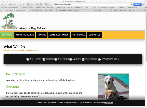 |
| Full screen 15" Laptop view 1440 X 900 |
This is a Portrait view on a Tablet
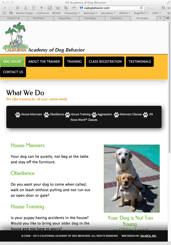 |
| Tablet Portrait view 780 X 1024 |
This is a Landscape view on a Tablet
 |
| Tablet Landscape view 1024 X 780 |
This is a Portrait view on a Smartphone
 |
| Smartphone Portrait view 320 X 480 |
This is a Landscape view on a Smartphone
 |
| Smartphone Landscape view 480 X 320 |
Visit Live Website: www.cadogbehavior.com
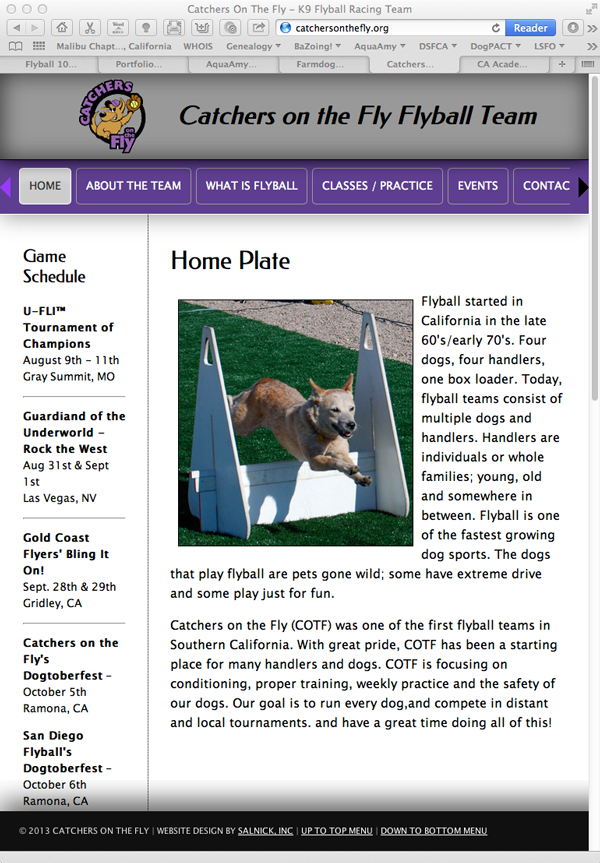
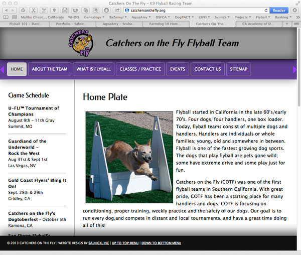
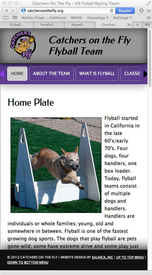
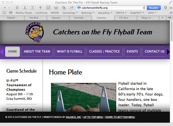
Catchers on the Fly Flyball Team
This is a view of the home page on a Desktop
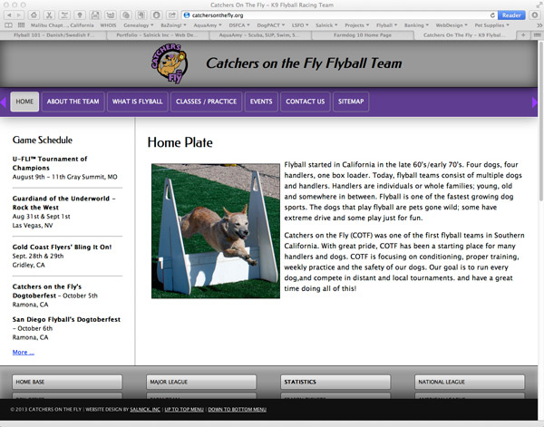 |
| Full screen Desktop view 1600 X 1200 |
This is a view of the home page on a laptop
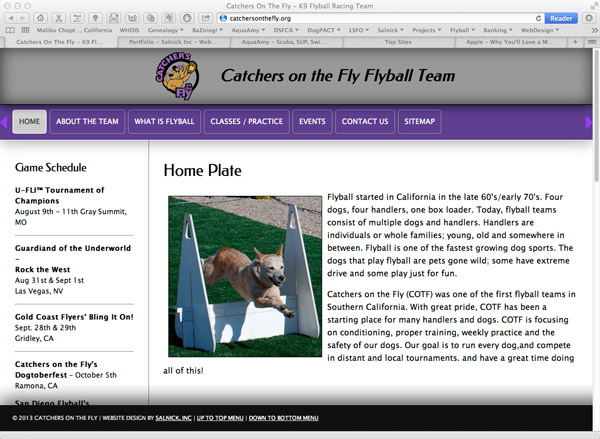 |
| Full screen 15" Laptop view 1440 X 900 |
This is a Portrait view on a Tablet
 |
| Tablet Portrait view 780 X 1024 |
This is a Landscape view on a Tablet
 |
| Tablet Landscape view 1024 X 780 |
This is a Portrait view on a Smartphone
 |
| Smartphone Portrait view 320 X 480 |
This is a Landscape view on a Smartphone
 |
| Smartphone Landscape view 480 X 320 |
Visit Live Website: www.CatchersOnTheFly.org
Single Page Designs